Monday, January 30, 2012

The Grazing Goat

Name: The Grazing Goat
Location: London


I love The grazing Goat for it's quaint feel and rustic elements. The wood paneled bar and walls, paired with the french and industrial furnishings, make the entire space feel warm and elegant. One of the things I enjoyed most about this space is that they were able to incorporate so many industrial finishes and furniture while still minting a country aesthetic overall.


All photos © The Grazing Goat

Friday, January 27, 2012

Firefly Grill

Name: Firefly Grill
Location: Effingham, IL

Styled after the traditional midwest barn, the Firefly Grill features a reclaimed wood facade with metal roof. Considered a modern roadhouse, Firefly has been creating local and organic food long before it was ever popular. The interior is outfitted with simple wood and metal furnishings and large vaulted ceilings in the main dining space. The space also features large walls of windows connecting the indoors and outdoors and has outdoor patio seating located on the dock to the lake. The homage payed to the traditional midwest barn is what truly excites me about the Firefly. With such a beautiful setting and wonderfully updated barn vernacular, how can you not enjoy your visit.


Photo 1-2 © Trip Advisor
Photos 3-5 © World Architects

Wednesday, January 25, 2012

Yusho

Name: Yusho
Location: Chicago

Located in the heart of Lincoln Square, Yusho is relatively new to the Chicago food scene but should should not be missed. Created by chef Matthias Merges (who, for 14 years, worked for Charlie Trotter), the space was inspired by his love for Japanese street food and culture. The space itself is a nod to the pure and simple origins with hints of Japan's vibrant culture. The bar is made of 'century old wood beams' and all of the light fixtures are reclaimed and hung at varying lengths throughout the space. I love how warm the space feels while still maintaining a great level of energy and visual interest. The warms wood tones paired with the saturated colors create a wonderful nod to the culture they are derived from.


Photos 1 © Thrillist
Photos 2-4 © Time Out Chicago
Photo 5 @ Tasting Table

Monday, January 23, 2012

The Folly Bar

Name: The Folly Bar
Location: London
Designer: Drake & Morgans

As a themed restaurant and event space, The Folly offers a wonderfully bright, fun and modern space.  Set up with multiple dining areas the space also features small lounge areas, a florist shop and a small grab and go market. While the scale of the space seems a bit too large, it does seem that they were able to carry the same idea through to the entire space creating a cohesive thought.

Gallery Image

Gallery Image

Gallery Image

Gallery Image

Gallery Image

Gallery Image

Gallery Image

Gallery Image


All images © The Folly Bar

Friday, January 20, 2012

Theresa Restaurant

Location: München, Germany

Theresa Restaurant feels like my favorite vintage shop. With a clean palate of grays and whites, the addition of warm wood, worn metal, and mis-matched chairs adds a subtle warmth and communal felling.
I love that the space comes together to make a perfectly cohesive concept without a pure recognizable style.  


All photos © Theresa Restaurant

Wednesday, January 18, 2012

We interrupt this programming...

As a blogger and designer, sharing information, ideas, and inspiration is a necessity to my trade. I will not support SOPA or PIPA and encourage you to join in the fight. Call your representative or sign the petition and tell them that you support a free and open internet.

I encourage you to take a look at this well done & informative video about SOPA & PIPA;


Sign the petition here.

Tori-Tori

Name: Tori-Tori
Location: Mexico City
Design/Architecture: Rojkind Arquitectos & ESRAWE Studio

This spectacular building is  home to what is considered, one of the best Japanese restaurants in Mexico City. The organic and semi-transparent double walled facade, acts to create a natural extension from inside to outside. The interior of the space features dining spaces set amongst plush foliage and were designed in collaboration with the buildings facade and openings. The texture and filtration of natural light, along with the creation of shadows and views, allows diners a different experience depending on the area they are dining in and the time of day. I can only image the experience diners receive as they approach and enter the space. This is truly a great example of an organic connection between inside and outside.


Tori Tori Restaurant / Rojkind Arquitectos + ESRAWE Studio © Paúl Rivera


Tori Tori Restaurant / Rojkind Arquitectos + ESRAWE Studio © Paúl Rivera


Tori-Tori Restaurant by Rojkind Arquitectos + Esrawe Studio (3)

Tori-Tori Restaurant by Rojkind Arquitectos + Esrawe Studio (2)


All photos via © Paúl Rivera via Archdaily

Monday, January 16, 2012

Bumble Los Altos

Name: Bumble Los Altos
Location: Los Altos, California

I love it when companies take design seriously, but realize that design doesn't have to be serious. When Bumble Los Altos showed up in my inbox, I couldn't have been more excited. The entire space was created on the concept of family dining and features multiple spaces for eating & playing. The entire space feels like you have entered a great friend's home, rather than a restaurant.


There is a communal dining space perfect for group get-togethers, bar for a quick lunch or glass of wine, lounge and play space centered around an interactive fish tank, indoor and outdoor play spaces for kids and outdoor patio for date nights.

Keeping the colors simple and sticking to a neutral palate with hits of grey and yellow, keeps the space bright, inviting and fun.
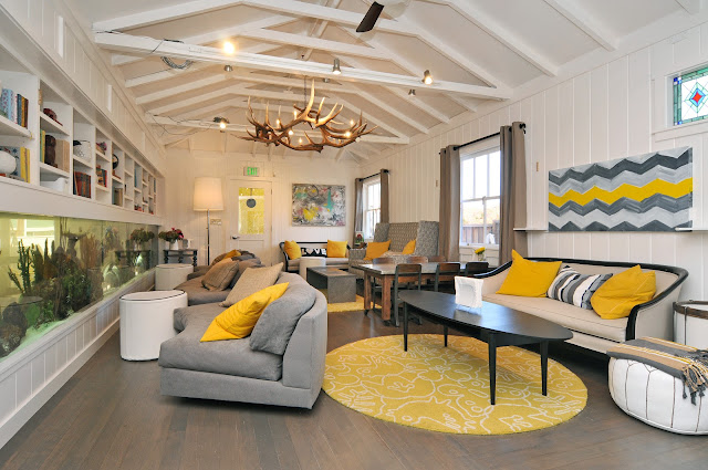

What I enjoyed most about this space, and concept, was that the entire space was designed for families but wasn't overly simplified. It reminds us that family dining can go beyond ball pits and happy meals.


All photos © Bumble Los Alto

Friday, January 13, 2012

Cocotte

Name: Cocotte
Location: Singapor
Design: Branding by Foreign Policy Design

Located in Singapore, Cocotte serves up rustic, French cuisine in a setting fitting of the food. The space feels comfortable and rustic and showcases a mix of industrial furnishings and antique french accessories. Foreign Policy Design created the graphic design and identity for the space and did a great job mixing the comfortable, rustic aesthetic with an urban, modern edge. One of my favorite elements of the space is the brightly painted Tolix chairs and Mooi pendant hanging overhead. It perfectly encapsulates the overall feel of the restaurant.

Cocotte - Restaurant

Pendant fixture design by Ron Gilads for Mooi

Cocotte Restaurant

Cocotte Restaurant

Cocotte - Design

 Cocotte - Menu

All Images © Whitezine via Cocotte
Related Posts Plugin for WordPress, Blogger...