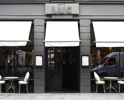
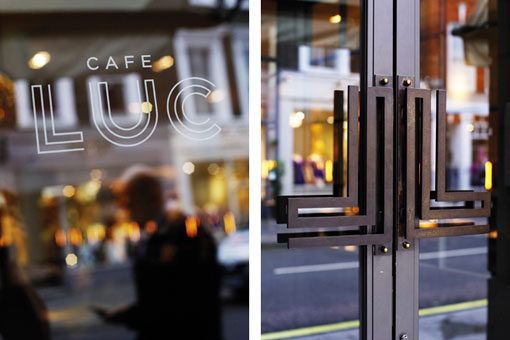
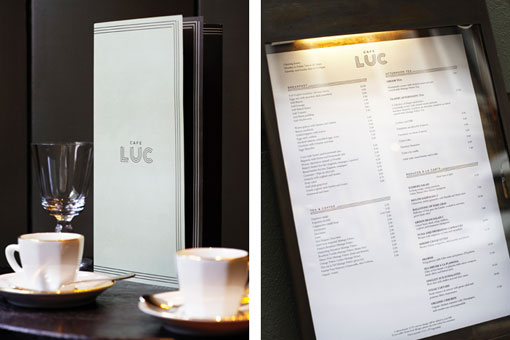
Showing posts with label graphic design. Show all posts

Friday, October 25, 2013

Duende

Name: Duende
Location: Oakland, CA
Design: Arcsine Architecture in collaboration with multiple local artisans.


With today's highly competitive restaurant scene, restaurant owners know that the need to offer more than just a great plate of food in order to attract and keep guests. Duende, located in Oakland, California was crated with this in mind and offers a bit for everyone. 

Monday, October 7, 2013

Clive Burger

Name: Clive Burger
Location: Calgary, Canada
Design: Unknown

Clive Burger is a wonderful example of a fast casual space with a modern and fun interior. Utilizing cartoon-esq graphics paired with a restrained material and color palate, allows the space to feel whimsy while establishing a clean and modern space. 

Friday, September 13, 2013

Elbow Room

Name: Elbow Room
Location: Brooklyn, NY
Graphic Design: mgmt. design
Interior: Greg Yang Design


I love it when the graphic design, identity, and interior all come together to form a cohesive space and presentation. The Elbow Room restaurants are a great example of this cohesive and thought through design. 

Wednesday, September 4, 2013

Beasley's Chicken + Honey

Name: Beasley's Chicken + Honey
Location: Raleigh, NC
Design: Unknown
Graphic Design: Joshua Gajownik


When looking for restaurants to feature on the blog, I am more often than not scouring through ten to twenty spaces before finding one that is inspiration worthy. Usually, I get so excited when I find something beautifully designed and worth sharing, that I often forget the others that sadly fell short. 

Beasley's is an example of a space I am finding all too common in the industry today. It is a space that forces me to ask myself, "Where is the design?"


Let me explain after the jump.

Monday, August 5, 2013

Lowbrau Bierhalle

Name: Lowbrau Bierhalle
Location: Sacramento, CA
Graphic Design: Band

Lowbrau bierhalle is a modern interpretation of the traditional German Beer Hall. I love that they took a traditional concept, reinterpreted it for their local, and created a space that refreshingly different while still playing homage to the original. 


Friday, May 24, 2013

Riffle NW

Name: Riffle NW
Location: Portland, OR


A well thought through concept is one where the restaurant owners consider all components of a guests' meal. From entry and exterior vantages, graphic design, and interior design, all the way to tableware, servers outfits, and take away, all components add up to create a cohesive concept. Riffle NW is a great example of a restaurant thinking through executing each of these components extremely well, providing a completely cohesive dining experience.


Friday, April 12, 2013

Top Hops

Name: Top Hops
Location: NYC, NY
Design: Helm Workshop- Identity


Top Hops is a craft beer goldmine in the heart of NYC. With great identity and branding, along with a functional and well laid out interior, the concept is cohesive and fun.


Monday, April 8, 2013

Town Mouse

Name: The Town Mouse
Location: Melbourne, Australia
Graphic Design: A friend of mine


Once again, a great example of typography and identity going hand in hand with restaurant design. The Town Mouse, located in Melbourne, took a simple color palate and created an interior that was relevant, fun, and modern.

Friday, March 22, 2013

Mexout

Name: Mexout
Location: Singapore
Graphic Design: Bravo Company

Mexout goes against the grain to create an urban interior paired perfectly with a purposefully imperfect branding scheme. 

Friday, February 8, 2013

Lucky's Doughnuts

Name: Lucky's Doughnuts & Forty Ninth Parallel Coffee
Location: Vancouver, BC


Located in Vancouver, Forty Ninth Parallel coffee brought together two great concepts under the same, well designed roof.


Using the great bones of their raw & urban space, industrial furnishings and a large wood bar act as a rich yet neutral backdrop to fresh made doughnuts and cappuccinos.

Wednesday, February 6, 2013

Our Work; The Salsa Truck

Local Chicagoans and food truck fanatics alike have probably already heard the great news. Chicago has officially given out its very first mobile food preparers license which allows chicago food trucks to now cook on-board. This historic moment for the restaurant and dining scene was added to by the fact that we had the pleasure of working with owner, Dan Salls on the first first food truck to ever cook on board, The Salsa Truck.

Kaper Design was responsible for the branding, logo, truck design, packaging, and all other printed goods. Here are a few images of our work;


Wednesday, December 12, 2012

Abi-Haus

Name: Abi-Haus
Location: Abilene, TX
Lettering: Tanamachi Studio


With the notion that 'everything is bigger in texas' I'd have to say that this pint sized space is pretty big on the details.

Friday, July 13, 2012

Graphic Bar

Name: Graphic Bar
Location: London


Located in the heart of London, the Graphic Bar created a merge of interior & graphic design. Using typeface and bold colors, the space feels urban, bright, and hip. One of my favorite components is the large letters blocked out on the garage door facades. Keeping the rest of the space neutral in color and using raw materials like wood, concrete and brick allow the graphics inside to tell the story. 

 See more after the jump.

Monday, March 19, 2012

Cafe Luc

Name: Cafe Luc
Location: London
Branding & Graphic design: Here Design

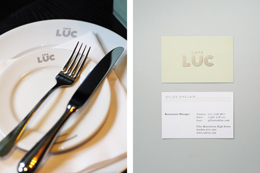
Today comes to you with another great example of brand identity for restaurants.

 The most common element I witness clients and restauranteurs miss, is brand identity. In order to be successful you must set your space up as a unique experience. Your space must be recognizable and your message needs to be carried through throughout the diners experience. With social media growing faster every day, most customers dining experiences actually start well before they arrive at your space. Establishing your identity and message through graphic design, web design, and social media presence cannot be brushed off. Cafe Luc did a great job of translating the dining experience you will have within the space, to their identity, branding, and logo. All aspects communicate a chic, comfortable, upscale and classic vibe, take a look;


Image 1-6 © Design Work Life
Image 7-10 © Tuannhaid

Wednesday, March 7, 2012

Super Whatnot

Name: Super Whatnot
Location: Brisbane
Architect: Marc&Co


Located in an old industrial building, Super Whatnot is a great example of quality branding, graphic design, and interior design. All crucial components that must work seamlessly together in order to create a visually successful space. With light wood, exposed brick, metal bar finishes, and exposed metal beams, the interior gives in to an urban/ industrial vibe while the penny tile, bar stools, wood stools and banquettes all add an element of vintage to the mix. The branding and graphic design finishes out the mix and pulls the entire urban/vintage/ industrial vibe together.


The combination of wood, intricate metal work, and exposed brick is wonderful. Perfectly industrial but just polished enough to feel finished and not gritty.


Photos 1-7 © AECCafe
Photos 8- 10 © Design Work Life
Related Posts Plugin for WordPress, Blogger...