Saturday, April 30, 2011

The Crosby Street Hotel


Name: The Crosby Street Hotel
Location: New York, NY

We love this Soho getaway because it fits. It responds to the area and the history of soho and creates a space that is at once modern and fun but also artistic and sophisticated. Every room boasts a different design and features unique, interesting pieces that always manage to capture our attention. The public spaces manage to feel like an artist gallery, greenhouse, and chic social spot all at once. Firmdale did a great job making the entire space feel like it has been in Soho for year, rather than a new construction, corporate hospitality job. Did we mention the terrace?, we could spend hours socializing with a beautiful space like that. And to think, before the Crosby Street Hotel, the site was nothing more than a quickly deteriorating car park.


All images © Firmdale Hotels

Tuesday, April 26, 2011

Local favorite: Gilt Bar


Name: Gilt Bar
Location: Chicago, IL
Designer: Chef Brendan Sodikoff


After a long day of work there are few places in the city that have the innate ability to make you feel completely relaxed. Gilt Bar has mastered the effortlessly cool vibe and manages to be both, a bar and a restaurant. The space is what we would consider 'vintage modern' and features long, leather chesterfield sofa's, reclaimed wood tables, modern and salvaged chandeliers and exposed brick walls.


All images © Chicago Mag

Thursday, April 21, 2011

Goat Town

Image © The Feast


Name: Goat Town
Location: Alphabet City, NYC
Designer: Owner Nicholas Morgenstern

While we find the design fairly cookie cutter in terms of current design trends; Reclaimed materials, Edison bulbs, tin ceilings, and subway tiles; What we do love is the unexpected use of subway tiles on the booths! This fairly mainstream interpretation of the American Gastro-Pub is popping up quite often and we find it refreshing and a bit heart-warming when typical materials get turned on head and re-purposed for ways you never would have thought. We cannot comment on the comfort of the booths but this kitschy touch is definitely worth a stop in.

Image © Popsugar NYC

Image © Eater NY

Tuesday, April 19, 2011

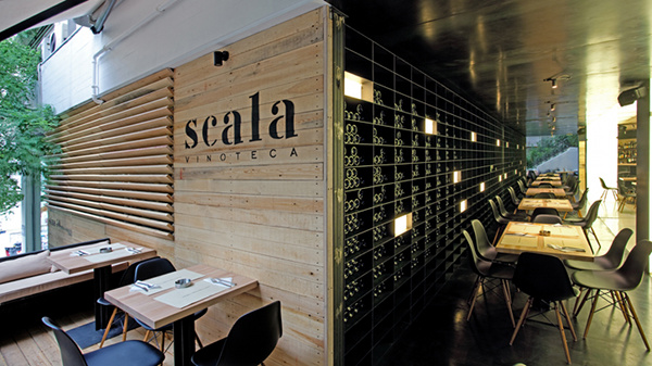
Scala Vinoteca

Name: Scala Vinoteca
Location: Athens, Greece
Designer:Andreas Kurkulas & Maria Kokkinou

We love this space because of its minimalist, modern vibe and strong character. A nod to the vineyard and wine-making process is apparent through the tractor seat bar stools, use of metal throughout the space and the amount of natural wood. It feels like a space you could easily spend hours with friends at.


All images © George Fakaros via Yatzer

Friday, April 15, 2011

The Blue Monkey Fumoir

Location: Zurich Old Town, Switzerland

We are loving the vintage feel or this space mixed with the modern accents. Ultimately the concept is truly what roped us in. A smoking room, like you would have had back in the 20's in Switzerland, updated for modern times. ( Think English pubs meets modern gentleman's club) Despite the smoking bans in Zurich, the Blue Monkey wanted to offer its guests a place to smoke and what they accomplished with the interior, we picture, will easily accommodate the men in suits that head in for a drink after work.


All images © dyersmith-frey.com

Thursday, April 7, 2011

Soho House; Miami- Cecconi's Restaurant


Name: Cecconi's Italian Restaurant at the Soho House Miami Hotel
Location: Miami, FL
Designer: Mark Brudnizki & Nick Jones (soho house founder)

Miami has never ranked very high on our list of vacation destinations (that we absolutely must get to) but with the addition of the Soho House, We all may just need to reconsider! We love that they paired traditional furnishings with an outdoor-terraced setting. The result is romantic, fun and looks extremely inviting and relaxing. Our favorite design element in the space has to be the large chesterfield sofa that has been updated in a great fabric (Fun fact: It was upholstered by a company right here in Chicago!) and the almost ball-jar-esq pendants. We can only image how magical this space can become once the sun sets.


All images © Cecconi's

Tuesday, April 5, 2011

Theurel & Thomas Patisserie


Name: Theurel & Thomas Patisserie
Location: San Pedro, Mexico
Designer: Anagrama


This little gem was passed along to me by a friend and I am so glad he shared! Pure milky perfection, in my opinion. The amount of detail and remaining true to the all-white concept allows for the macaroons colors to burst throughout the space. What I love the most about this space is that is shows us that a monochrome platte doesn't have to be cold or stark. Too many time I hear that the all white interior will make the space feel cold and uninviting but, if done correctly, it can provide exactly the opposite. This space achieved the monochromatic design with its use of detailed furniture and fixtures. These items provide just enough contrast to keep the space inviting and exciting. I always enjoy experiencing interiors where you can see the trust between the designer and the client, it always provides the best design.
(did you notice the under-lit cabinet and storage? icing on the cake!)

All photos © Anagrama

Now I just need to take another trip to Meixco, who's coming with me?!


Friday, April 1, 2011

Viceroy Hotel & Resort; Santa Monica


Name: Viceroy Santa Monica
Location: Santa Monica, Ca
Designer: Kelly Wearstler

The Viceroy Resort in Santa Monica shows a great balance of color, traditional and modern. I adore the bold kelly green color that is showcased throughout the public spaces and think the preppy and modern color palette works perfectly to highlight the wonderful environment of the space.


Related Posts Plugin for WordPress, Blogger...