Saturday, September 24, 2011

Hopper Creek Kitchen


Name: Hopper Creek Kitchen at the Hotel Yountville
Location: Napa Valley, CA
Designer: Lisa Holt, DLS Hotels


I'll admit, I'm a Sonoma/ Russian River Valley girl. However, the Hotel Yountville has me rethinking my next wine tasting trip. The sophisticated and rustic atmosphere paired with the natural beauty surrounding the hotel, is a breathtaking combination. The exposed beams and wood burning fireplaces blend seamlessly with the view outdoors, while the traditional-lined furnishings add classic sophistication. 


The Hotel:

Yountville Autumn November 2010


Hotel Yountville Lobby


Hotel Yountville Lobby


Hotel Yountville Pool


Premium Guest Room


The Restaurant:
Hopper Creek Kitchen


Sunday, September 18, 2011

The Greenwich Hotel

Location: New York
Designer: Grayling Design


The Greenwich Hotel is located in Tribeca. Situated on a corner lot, the brick-clad exterior feels as warm and comfortable as the interior. Featuring rich woods, oriental rugs and traditional lined furnishings- the space feels warm, inviting and comfortable. The same feeling is carried through to the hotel's restaurant; Locanda Verde. Metal work, dimly lit by industrial pendants and saturated by warm brick and wood the interior complements the home-spun and approachable italian menu. (One last interesting tidbit- it's owner is Robert DeNiro)


all photos © The Greenwich Hotel

Friday, September 16, 2011

Ruxbin

Name: Ruxbin
Location: Chicago, IL

Another restaurant listed on Bon Appetites best new restaurant list was Chicago's own; Ruxbin. I'm still not 100% on board with the final design, however with it's landing on the best new list, I thought it was worth showcasing to see what your thoughts were on the space.

I love the idea and theory behind the space. Reclaimed, recycled and renewed- I can completely jump on board with that one. I think this design style especially works with small businesses, it can help keep cost low and can provide a great warmth and character to the space. I also love the sustainable aspect of reuse, recycled and reclaimed.

I  admire the warmth and sepia tone of the space but I find that I enjoy single elements, rather than the whole concept. Those vintage chairs-love, the repurposing of chairs as light fixtures-love, the adaptive reuse of a dj booth as a division for the long narrow space-love. Bring these elements together though and something is missing. The cohesion seems lost.


Ruxbin-interior.jpg

Image 1,4 © Ruxbin
Image 2 © Star chefs
Image 3 © Bon Appetit 


Tuesday, September 13, 2011

Bodega Tapas Restaurant & Bar

Name: Bodega Tapas Restaurant and Bar
Location: Australia

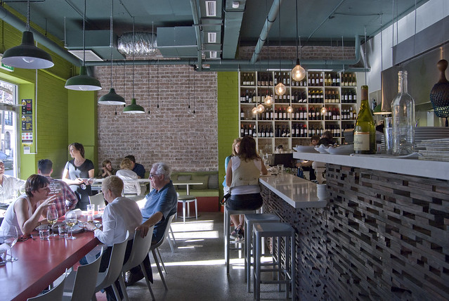
This small restaurant and bar space is the perfect example of bold color and texture. I love the bright pops on the front wall, side wall mural and ceiling, as well as the beautiful texture and pattern created on the bar.  I also enjoy the use of multiple seating group types. It allows a bit of something for everyone and lets the space be a perfect neighborhood gathering space.


 Photos 1&2 via Bodega Tapas
Photo 3 via Not quite nigella

Friday, September 9, 2011

Mad Cow

Name: Mad Cow at the Ivy
Location: Australia


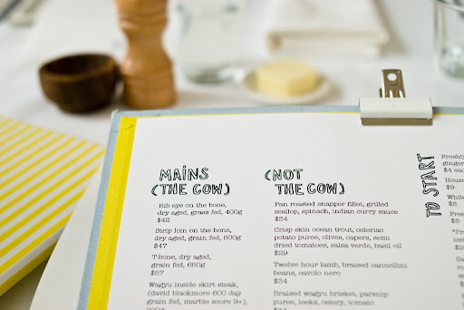
Located in Sydney, Mad Cow is a bright and cheerful addition to The Ivy. With a color palate of white, yellow and green the interior feel fresh and energetic. The wicker furniture, over scaled drum fixtures and slivers of faux grass give the space a Palm Springs vibe without feeling too kitschy.

Image 3 © Eat Show and Tell

Wednesday, September 7, 2011

Congress; Second Bar + Kitchen


Name: Congress- Second Bar + Kitchen
Location: Austin, TX

Another from Bon Appetit Best New list of 2011 is Congress, located in Austin Texas. Congress consists of three parts that all work together and yet independent at the same time. The best of the three, in my view, is second bar + Kitchen. More casual than the others, it manages to keep an urban yet sophisticated feel. The scale of the large pendant fixtures and the division of space catch my eye and I love the use of the tolix stools in a more refined setting along with the other industrial linear fixtures mounted above the main dining space.


Image 1 © Bon Appetit
Image 3 © statesman
Custom Bar Stools provided by: Gary Weeks & Company

Monday, September 5, 2011

Local Favorite: La Colombe

Name: La Colombe
Location: Chicago, IL

La Colombe is a coffee roaster that started in Philadelphia and now has locations in Manhattan, Philadelphia, and Chicago. Their newest location in Chicago is one of my personal favorites for grabbing a perfectly poured cappuccino and catching up with friends.

The space features slate blue and fire red subway tiles contrasted by exposed beams, polished organic wood furniture hand crafted by Octo Studios in Philadelphia. For an added bonus, I recommend stopping by on a day they are roasting. Roasting happens right in the shop and adds a heavenly aroma and wonderful visual to the experience.


Images © Kaper Design


Saturday, September 3, 2011

Husk


Name: Husk
Location: Charleston, SC

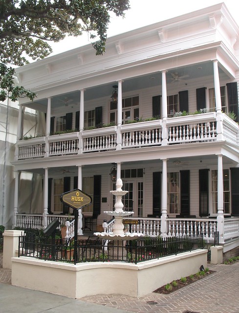
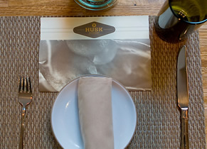
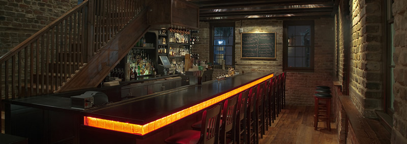
Husk is another Bon Appetit Magazine top restaurant for 2011. The first image truly expresses the feeling of the space, "Historic Roots Modern Disposition". Located in a very classic, plantation style Charleston structure, the restaurant focuses heavily on local farms and sustainability. (I highly encourage everyone to take a look at their website, it is highly interactive and showcases the seasonal products they are using and the farms they are getting them from.) I adore the logo and branding of Husk and love that it continues the idea of fork to fork from the moment you walk through the doors.


Husk Logo


Press Archive


Image 1,3-5@ Husk
Image 2@ Flickr
Related Posts Plugin for WordPress, Blogger...