Wednesday, February 29, 2012

Trade

Name: Trade
Location: Boston

In the restaurant industry, you really can't beat a location with great bones. Having a structure that already has so much going for, is a pretty sure fire bet that even with a minimal amount of creativity, the space will look great. Trade in Boston is a great example of a space with great bones. Exposed, rough-around-the-edges brick, large windows, exposed beams, and high ceilings add a rich backdrop for an eclectic mix of furnishings. Keeping the majority of the seating high, respects the scale of the space and leaves it feeling less imposing and more welcoming & comfortable.


All images © Trade

Monday, February 27, 2012

Coquine


Name: Coquine
Location: London

Coquine is french for 'mischievous' and the interior fits the bills. Warm, inviting, dimly lit and encompassing, with golds, bold blues and blacks being the primary colors, the interior feels a bit mischievous itself. the designer, Lee brooms, fashioned the light fixtures himself and I find the decanter lights to be extremely appealing. Created from found decanters, each light in itself is unique.


All images © The Cool Hunter

Friday, February 24, 2012

Jeffery's Grocery

Name: Jeffery's Grocery 
Location: NY

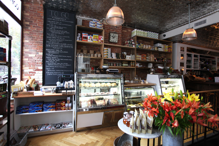
There is always something special about brick and a tin ceiling. Maybe it's the reference and feeling of home but no matter what, it always exudes character and warmth. Jeffrey's Grocery is a great example of this character and warmth. As a grocery and oyster bar, you can come in for everything from produce to a great dinner. I adore that the grocers' main floor has an intimate amount of seating, primarily located at bar-height communal tables. The chalkboard walls, rough wood shelfs reminiscent of crates, and rich dark wood give the space a feeling as if it's been there forever.


I find myself drawn to Jeffrey’s Grocery
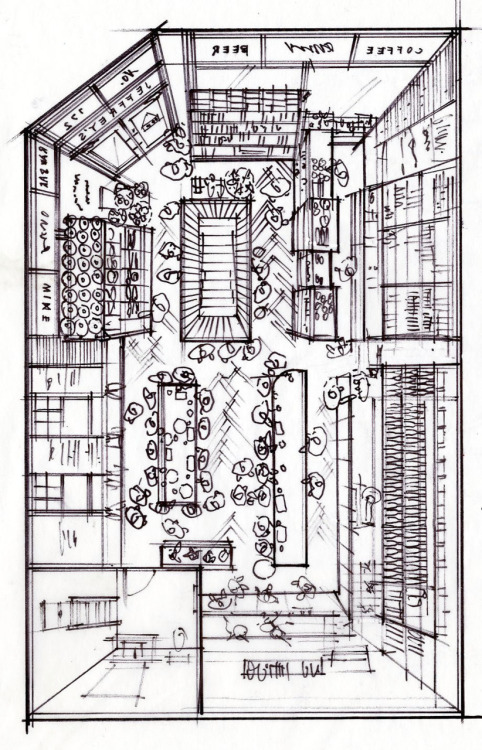
I have become rather fond of bird’s eye views, especially after Mike’s sketch of our Thanksgiving preparations, so decided to try my messy hand at it. Jeffrey’s Grocery is our favorite place in West Village for beer and charcuterie. The owner and most everyone who works there are from Wisconsin- so you know it has to be good. Check it out next time you are in the neighborhood. We recommend you give the Six Point “Little Wisco Special” a try. 
R
Image 1-3 © a continuous lean
Image 6 © Line + Paper


Wednesday, February 22, 2012

Cochon

Name: Cochon & Cochon Butcher
Location: New Orleans

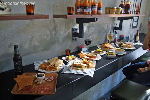
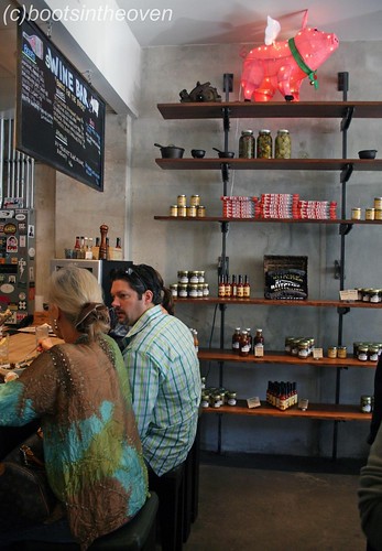
Did you know that 'cocoon' literally means pig? It's pretty fitting for this traditional cajun southern cuisine being served. After my quick trip to NOLA this past weekend, it is only fitting to post about one of the best restaurants in the city. Located in the central business district, the semi-industrial setting is fitting for the butchery and separate restaurant.  I love the exposed brick and bench seating in the restaurant and industrial open shelving in the butchery.

The restaurant:
 Cochon chefs.JPG
The Dining Room and Open Kitchen

The butcher shop:
Cochon Butcher – New Orleans, LA


Our Impressive Spread

The sWine Bar


Image 1 © Nola.com
Image 2,6-7 © Boots in the oven
Image 4-5 © Star chefs

Tuesday, February 21, 2012

Mary Queen of Scots


Name: Mary Queen of Scots - Now Closed
Location: New York, NY

Mary Queen of Scots is a scottish bar & gastropub, located on the Lower East Side of NY. Designed to resemble a traditional Scottish country house, the design incorporates traditional elements in updated ways. The bright plaid on the the tufted booths, geometric mirrored ceiling inlay over the bar, and mixture of chair and booth styles all give a warm and rustic feeling while still remaining hip and trendy enough to be located in NYC.


All photos © Mary Queen of Scot

Friday, February 17, 2012

The Butcher Shop

Name: The Butcher Shop
Location: Boston, MA

Taking a cue from our post on Wednesday, I thought I would let you in on another space with a butcher shop component. The Butcher Shop, which is located in Boston, has some wonderful and highly practical details. The large  butcher block, industrial hooks, and rich wood floors give the space a rustic and historical feel. I enjoy that the center of the restaurant space is the over-sized butch block with glass sneeze guards. It helps to emphasize the purpose of the space and adds a casual, and hand crafted feel to the over all space.


Image 1 © Stay
Image 1,3,4 © The Butcher Shop

Wednesday, February 15, 2012

Fette Sau

Name: Fette Sau
Location: Brooklyn

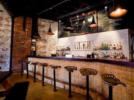
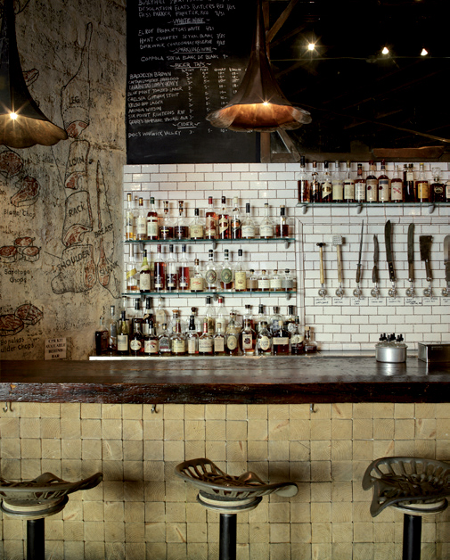
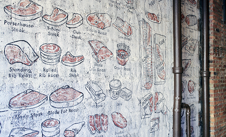
What I enjoy the most about Fette Sau, is that they addressed the butchery side of the meal. While we often see the rustic/industrial ideas coming into play with BBQ joints, you commonly don't seen the butchery side come out at all. Fette Sau managed to incorporate this element, without making it overbearing or overly graphic. Instead, it has elements of the classic butcher shop which also having the rustic aspects such as tractor seat bar stools, wood topped tables and exposed structure.

Eater Review - Fette Sau


The meat illustrations drawn on the wall and knife pulls, drive home the butcher feel and create a fun visual element to the space.


Image 1 © Will work for food
Image 2-3 © Fast Company
Image 4 © franimal flickr

Monday, February 13, 2012

Lagkagehuset 'The Cake House'


Name: Lagkagehuset
Location: Copenhagen

Lagkagehuset, which roughly translates to 'The Cake House', is a great example of a minimalist and modern interior utilizing high quality, rich materials. The end result is a space that is both warm and bright, feels comfortable and yet completely chic all at once. This bakery focuses on handmade breads, pastries, and coffee and the interior supports and showcases these products.


Image 1-5 © Space

Friday, February 10, 2012

Local Favorite; Heritage Bicycles

Name: Heritage Bicycles
Location: Chicago, IL

There is little I love more than a local coffee shop on a cold chicago afternoon. The newest to hit the Chicago scene decided to raise the bar a bit and is not only supplying the windy city with Stumptown, but also with locally, handcrafted bicycles. The space merges the two beautifully. With a handmade, yet refined feel, the interior is comfortable and inviting. The long communal table in the center of the space acts as the landing ground for the the biking community to grab a cup of coffee while waiting for a tire change or tune up. Booths are upholstered with bags from beans imported by Stumptown and there is even a light fixture made from Edison bulbs and bicycle rims. Walls are decked out in moldings filled with either mirrors or chalkboards listing specials and services and add a great amount of light to the space. Overall the space feels well pulled together and just as hand crafted as the bicycles and coffee they feature.


Image 1-5 © lgrab
Image 6 © Bicycle Retailer

Wednesday, February 8, 2012

B.A.R.

Name: B.A.R.
Location: Stockholm, Sweden

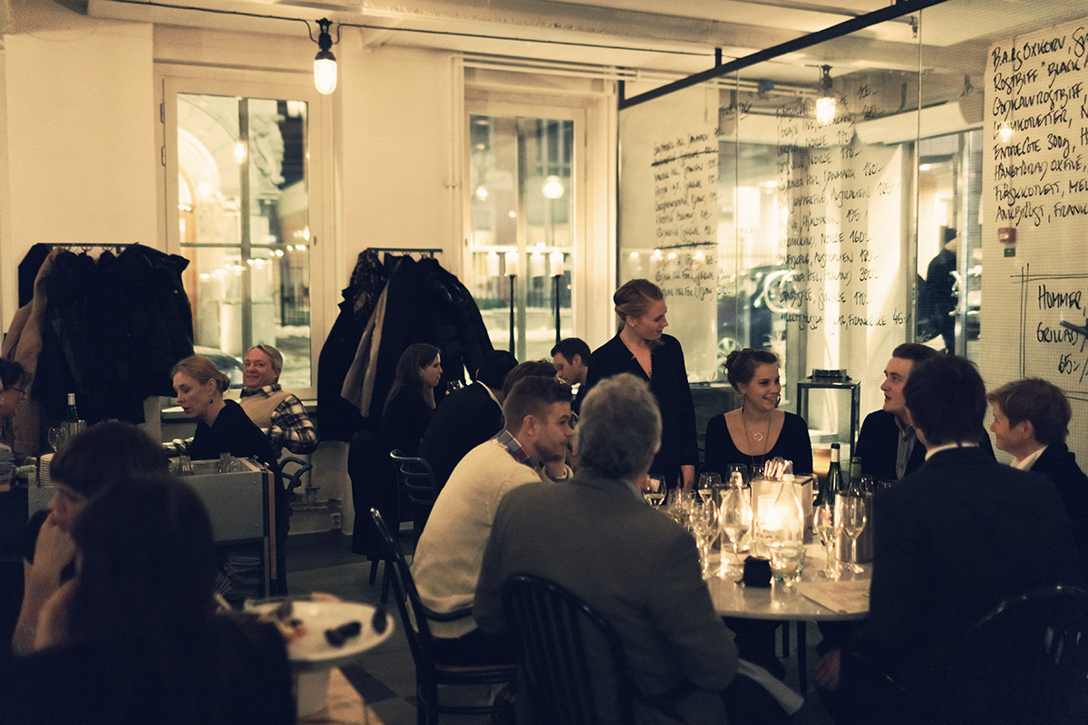
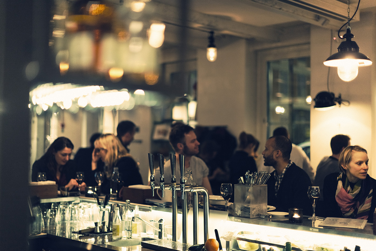
B.A.R. (Blasieholmens Akvarium Restaurang) is an approachable and timeless restaurant located in the heart of Stockholm. With a goal of serving 'uncomplicated, delicious fresh food' they have also managed to create a space fitting of the beautiful food being put out. With classic scandinavian details; neutral and bright color palate, natural materials, and simple yet beautiful displays and execution, B.A.R has given us a space that is bright, airy and yet approachable and comfortable. The almost handcrafted aesthetic to the space drives home the simple, handcrafted nature of the food which creates a perfect marriage of interior and food. This symbiotic relationship is what I believe to be necessary for a successful restaurant.


Image 1,6 © kikki-k
Image 2,6 © Koncept Stockholm
Image 3-5 © B.A.R.


Related Posts Plugin for WordPress, Blogger...