Follow us on Tumblr, Facebook, & Twitter for more of your favorite restaurant design inspiration as well as the latest happening of the Kaper Design team!
Saturday, March 10, 2012
Want more?
Did you know that you can find even more Kaper Design?
Follow us on Tumblr, Facebook, & Twitter for more of your favorite restaurant design inspiration as well as the latest happening of the Kaper Design team!
Friday, March 9, 2012
Fitch & Shui
Name: Fitch & Shui
Location: Amsterdam
Designer: D/Dock
Location: Amsterdam
Designer: D/Dock
Fitch & Shui covers it all and does it well. As they are open for all meals, the space was designed in sections, each open accommodating a different meal. (Have you noticed you don't see many places open for all meals anymore?) The space is large but is laid out well and allows you to feel its' expansive nature while also remaining intimate. What I love most in the space is the the industrial/ modern bar with black subway tile and corrugated metal overhang.
All photos © The Contemporist
Wednesday, March 7, 2012
Super Whatnot
Name: Super Whatnot
Location: Brisbane
Architect: Marc&Co
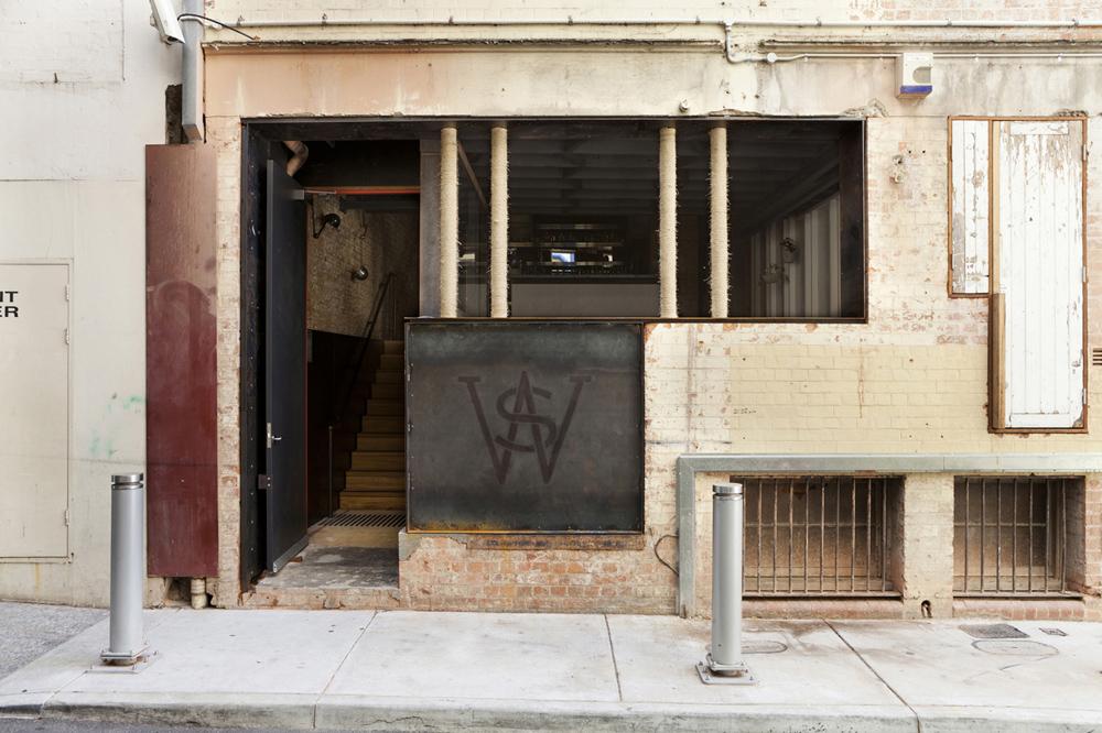
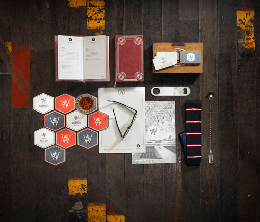
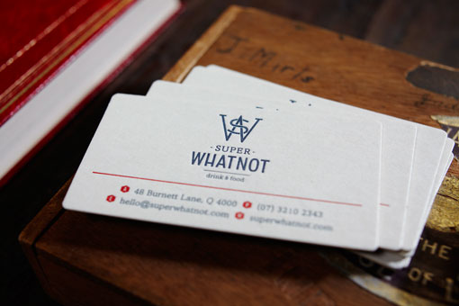
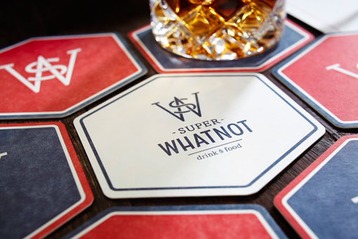
Located in an old industrial building, Super Whatnot is a great example of quality branding, graphic design, and interior design. All crucial components that must work seamlessly together in order to create a visually successful space. With light wood, exposed brick, metal bar finishes, and exposed metal beams, the interior gives in to an urban/ industrial vibe while the penny tile, bar stools, wood stools and banquettes all add an element of vintage to the mix. The branding and graphic design finishes out the mix and pulls the entire urban/vintage/ industrial vibe together.
The combination of wood, intricate metal work, and exposed brick is wonderful. Perfectly industrial but just polished enough to feel finished and not gritty.
Location: Brisbane
Architect: Marc&Co
Located in an old industrial building, Super Whatnot is a great example of quality branding, graphic design, and interior design. All crucial components that must work seamlessly together in order to create a visually successful space. With light wood, exposed brick, metal bar finishes, and exposed metal beams, the interior gives in to an urban/ industrial vibe while the penny tile, bar stools, wood stools and banquettes all add an element of vintage to the mix. The branding and graphic design finishes out the mix and pulls the entire urban/vintage/ industrial vibe together.


The combination of wood, intricate metal work, and exposed brick is wonderful. Perfectly industrial but just polished enough to feel finished and not gritty.


Photos 1-7 © AECCafe
Photos 8- 10 © Design Work Life
Monday, March 5, 2012
Walden
Name: Walden
Location: Brooklyn
I love the simplicity of Walden, located in Williamsburg. The neutral color palate of black, white, brown, and gold gives off a touch of Scandinavian style, while the wood floors and tin ceiling are pure brooklyn. I also enjoy the light fixtures used throughout the space; simple, pure in form and just enough to add a warm sparkle at night.
Location: Brooklyn
I love the simplicity of Walden, located in Williamsburg. The neutral color palate of black, white, brown, and gold gives off a touch of Scandinavian style, while the wood floors and tin ceiling are pure brooklyn. I also enjoy the light fixtures used throughout the space; simple, pure in form and just enough to add a warm sparkle at night.

Image 1-3 © WaldenNYC
Friday, March 2, 2012
Isa
Name: Isa
Location: Brooklyn
Designer: Taavo Sommer
Taking cues from Buckminster Fullers' Geodesic dome, isa features geometric shapes with a rustic touch to balance it all out. With a rooftop garden that produces some of the restaurants veggies and herbs, the natural and organic element is continued inside with a wood burning stove, stacked logs, exposed wood beams and herbs drying from the ceiling. Isa could easily be described as a modern lumberjack, combining the rustic, earthy qualities with modern lines and sensibilities. It feels perfectly suited with Brooklyn.
Location: Brooklyn
Designer: Taavo Sommer
Taking cues from Buckminster Fullers' Geodesic dome, isa features geometric shapes with a rustic touch to balance it all out. With a rooftop garden that produces some of the restaurants veggies and herbs, the natural and organic element is continued inside with a wood burning stove, stacked logs, exposed wood beams and herbs drying from the ceiling. Isa could easily be described as a modern lumberjack, combining the rustic, earthy qualities with modern lines and sensibilities. It feels perfectly suited with Brooklyn.


All images © Gothamist
Wednesday, February 29, 2012
Trade
Name: Trade
Location: Boston
In the restaurant industry, you really can't beat a location with great bones. Having a structure that already has so much going for, is a pretty sure fire bet that even with a minimal amount of creativity, the space will look great. Trade in Boston is a great example of a space with great bones. Exposed, rough-around-the-edges brick, large windows, exposed beams, and high ceilings add a rich backdrop for an eclectic mix of furnishings. Keeping the majority of the seating high, respects the scale of the space and leaves it feeling less imposing and more welcoming & comfortable.


Location: Boston
In the restaurant industry, you really can't beat a location with great bones. Having a structure that already has so much going for, is a pretty sure fire bet that even with a minimal amount of creativity, the space will look great. Trade in Boston is a great example of a space with great bones. Exposed, rough-around-the-edges brick, large windows, exposed beams, and high ceilings add a rich backdrop for an eclectic mix of furnishings. Keeping the majority of the seating high, respects the scale of the space and leaves it feeling less imposing and more welcoming & comfortable.


All images © Trade
Monday, February 27, 2012
Coquine
Name: Coquine
Location: London
Coquine is french for 'mischievous' and the interior fits the bills. Warm, inviting, dimly lit and encompassing, with golds, bold blues and blacks being the primary colors, the interior feels a bit mischievous itself. the designer, Lee brooms, fashioned the light fixtures himself and I find the decanter lights to be extremely appealing. Created from found decanters, each light in itself is unique.


All images © The Cool Hunter
Subscribe to:
Posts (Atom)