Wednesday, November 30, 2011

Busaba Eathai

Name: Busaba Eathai
Location: London
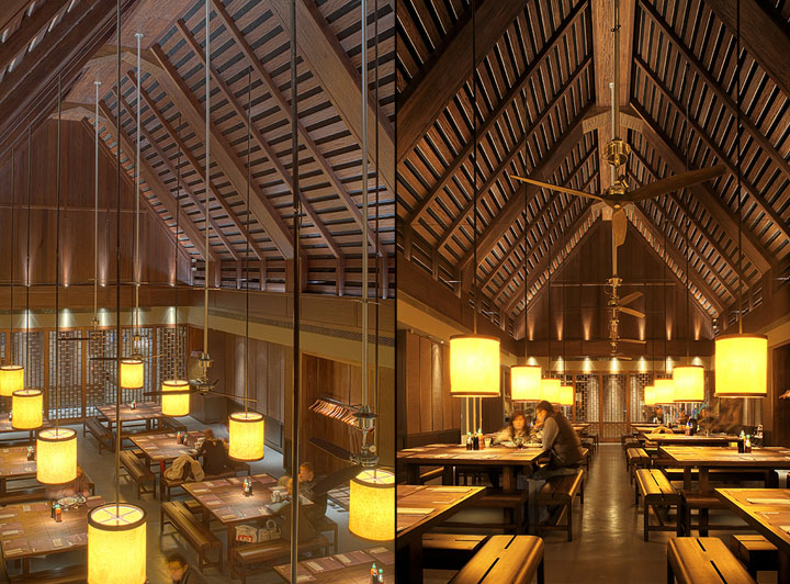
Designer: David Archer Architects & lighting by Firefly Lighting

A stunning use of scale and wood. I love the monotone palate with warm lighting flooding over each large table.  I also enjoy that despite the grand scale of architecture, the interior feels intimate and warm. Proof that simplicity and attention to details can go far to create a much grander experience.


Busaba Eathai by David Archer Architects Bicester Busaba Eathai by David Archer Architects, Bicester

Busaba Eathai by David Archer Architects Bicester 02 Busaba Eathai by David Archer Architects, Bicester

Busaba Eathai by David Archer Architects Bicester 05 Busaba Eathai by David Archer Architects, Bicester
Busaba Eathai by David Archer Architects Bicester 07 Busaba Eathai by David Archer Architects, Bicester


Monday, November 28, 2011

A look at brand growth; Costa Coffee

Name: Costa Coffee
Location: London
Designer: Your Studio


Costa Coffee recently unveiled a new design for their metropolitan stores and the design is clean and fresh. Many of their other locations(this is a chain coffee shop), look like typical coffee shops and while warm, appear a bit dated for todays coffee culture. The new design focuses on use of space, layout and creates areas for multiple customer types. By creating a more industrial and urban feel to the space, they have established a new customer demographic while staying true to their craft. Spaces like these remind us that a well thought through design, with proper space planning and customer experience analysis, can produce a stunning and highly profitable result. Many people forget that a designers job is to ensure the space will fit within its location and demographic, while minting a focus on profitability, correct merchandising and back of house operation flow.  I always encourage clients to remember that their space is more for their customers and less for themselves. While a space needs to reflect the product, it also needs to guarantee profitability and a fully thought out concept. This ensures customers will have a full and memorable experience from the moment they see signage until they walk back out the door.

Costa Coffee is a great example of a company letting their own personal preferences and previous experiences take a back seat to what the area, clients, and times were asking for. Through the design, they have guaranteed a continued support for their craft and a continued profitability for their company.

Costa's more traditional design:


The proposed new design for urban centers:


Photo 2-3 ©  Your Studio

Saturday, November 26, 2011

Noma

Name: Noma
Location: Copenhagen
Designer:


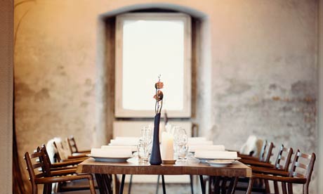
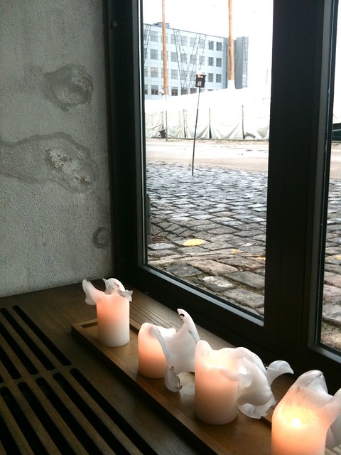
It is easy to see why Noma was ranked No.1 on San Pellegrinos' “World’s 50 Best Restaurants” list for 2010(pushing out El Bulli). The restaurant serves Icelandic style cuisine in an absolutely perfect atmosphere. Worm brick, timber beams, dark wood floors and classic Danish style furnishings strike a perfect balance to the beautifully plated, seasonal food. Noma is a great example of beautiful design and food coming together to create a seamless  finished product. The balancing act of these two components is what creates a a positive and memorable experience for a diner. 


Image 1 © Lovely lifestyles
Image 2 © The fab day
Image 4 © The Guardian UK
Image 5 © flickr

Friday, November 25, 2011

Grange Hall

Name: Grange Hall 
Location: Chicago, IL


Nestled down on Randolph Street in Chicago's foodie haven, Grange Hall can be identified by the beautiful white wood barn doors that were recently unveiled.
With a farmhouse feel, most of the space was completed by family and staff, giving it a dose of homemade character. I love the larger tables and the many uses of wood infused into the space. The woven wood wall adds depth and texture and provides a wonderful backdrop for the modern cow art that rests on top. I also love the wallpaper and patterned squares that add a nice hit of color to the space. Ultimately, Grange Hall feels comfortable, familiar yet not completely rustic. They have achieved a great balance in the interior, I can only image that would continue with the food. 


All images © Eater Chicago


Monday, November 14, 2011

The Redbury

Name: The Redbury
Location: Los Angeles, CA
Designer: sbe + Matthew Rolston 

Words cannot describe the beauty I just stumbled across. LA is typically not my first choice of travel destination (although with the vastly growing food scene and public transit gaining ground, it may be soon!). This hotel and restaurant are fun, quirky, and yet beautifully curated and refined. Take a look at the plethora of photos below and you will quickly see why The Redbury has jumped to the top of my LA list.


All photos © The Redbury

Monday, November 7, 2011

Brooklyn Winery

Name: Brooklyn Winery
Location: Brooklyn
Designer: WRK Design


I need to acknowledge how excited I am that Brooklyn now has a winery. The space is a perfect mix of reclaimed, worn, warm, and inviting. The wood wainscoting, painted brick and industrial pendants add a rich warmth to the space and the use of long, community style tables follows through with the social and community feel of the space. I love the verticality created with the reclaimed, stacked wood wall and long tables. I also adore the large, re-purposed outdoor space, perfect for a warm summer night. All materials used in the space were completely reclaimed and repurposed. It is always great to see designers get creative with materials and the polished, finish space of Brooklyn Winery speaks to the successful use of those creative endeavors .

Brooklyn Wine Bar


brooklyn-winery-private-room.jpg

Photos 1-4 © Brooklyn Winery
Photo 5 © UntappedCities
Related Posts Plugin for WordPress, Blogger...