Saturday, December 31, 2011
Friday, December 30, 2011
A Look Back; 2011 Local Favorites
Here is a look at a few of our hometown favorites. We can't wait to see who will make the list in 2012.
Clockwise from top left;
Gilt Bar
Avec
Piece Brewery & Pizza
Hubbard Inn
Doughnut Vault
Girl & the Goat
Radisson Blu Aqua Hotel
La Colombe
Lillie's Q
Blackbird
Longman & Eagle
The Coffee Studio
Thursday, December 29, 2011
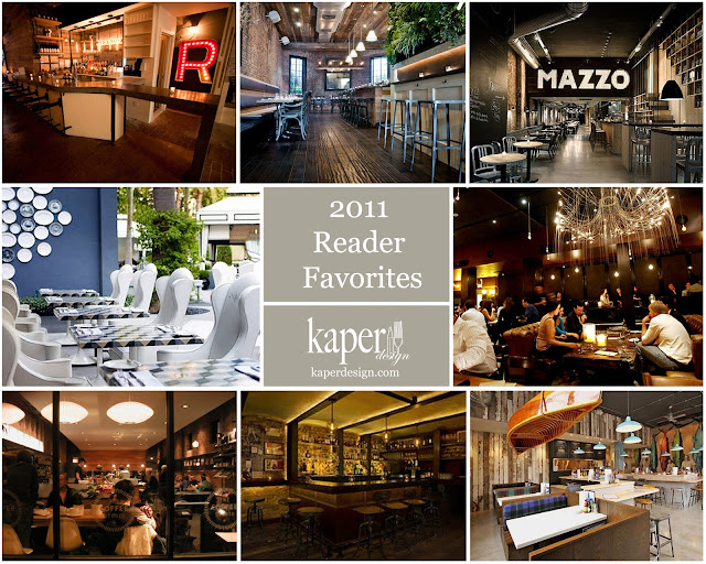
A look back; 2011 Reader Favorites
The Reader Favorites from 2011 (clockwise from top left);
The Fat Radish, NY
Colonie, NY
Mazzo, Netherlands
Gilt Bar, Chicago
Fish Bar, Chicago
Bell, Book & Candle, NY
The Coffee Studio, Chicago
The Viceroy Hotel, California
Tuesday, December 27, 2011
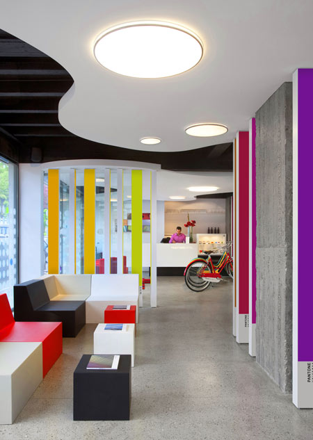
A colorful treat; The Pantone® Hotel
Name: Pantone® Hotel
Location: Brussels, Belgium
Designer: Michel Penneman & Olivier Hannaert
I have yet to meet a designer who doesn't love Pantone®. The color standard for almost all creative fields, their iconic branding has established a loyalty in even the most color-phobic among us. In the past few years, Pantone has done an excellent job at not only remaining relevant, but also main stream and desirable. The product design that has come out in full force as of recent, has established a renewed love within me and I was overjoyed to see an entire space dedicated to the love of color and color theory.
Each room and floor is themed based on color. Guests can choose the color or emotion they would like to experience and will receive a unique space catered to that very color.
Besides the rooms, the public spaces throughout the hotel are also coated in intense, saturated colors.
Image 1 © Karen Haller
Images 2-3 © Dezeen
Images 4-6 © Apartment Therapy
Image 7- 9 © NY Times
Sunday, December 25, 2011
Thursday, December 22, 2011
Guess Who- Unveiled!
You may be curious who the restaurant, listed in the 'Guess Who' post, belonged to. You may also be surprised to find out it is McDonalds! Thats right, McDonalds has hired on Paris designer; Patrick Norguet to re-image the stores style. This is the first of six locations throughout France whom will get the new makeover. The company is testing the new look as a hopes to establish themselves as a family restaurant rather than a teenage hangout.
So what do you think, is the new look enough? Would you be more willing to stop in if the stores had a new image?
So what do you think, is the new look enough? Would you be more willing to stop in if the stores had a new image?
All photos © LA Times
Saturday, December 17, 2011
Guess Who
Hello, today I am hear with a different type of post. I would love to know if anyone knows what restaurant this is?
Leave a comment if you think you know. I'll post the details Wednesday so be sure to check back in to find out.
Monday, December 12, 2011
A new meaning for 'coffee to go'
Name: illy coffee
Location: almost anywhere
Designer: Adam Kalkin
I love when boundaries are shattered and limits are pushed in architecture and design. Back in 2007, Adam Kalkin created a mobile solution from recycled and over abundant materials, for a home unit that could be folded down in a mere 90seconds. To further the design (and fun!) he teamed up with illy to create a mobile coffee unit. Whether you personally like the shipping container craze or not, you can't deny that this quirky solution, is anything but wonderfully eccentric and unique. While the solution might not be perfect, the space planning and design that went into this concept are admirable.


To see a video of the crate opening take a look at Architecture and Hygiene
All photos © G Living
Friday, December 9, 2011
Local favorite; Radisson Blu Aqua Hotel
Name: Radisson Blu Aqua Hotel
Location: Chicago, IL
Designer: Graven Images
Just before Thanksgiving, I got the opportunity to take a peak into one of the newest hotels here in Chicago, the Radisson Blu located in the famed Aqua Building. I will admit, I was intrigued and a bit doubtful about what the space would present design-wise. All preconceived ideas were thrown to the wind the moment I stepped through the doors. Before me was a well thought out concept that was more W Hotel than any Radisson I'd been in before. With a modern and warm atmosphere, the design took cues from Chicago's rich history and featured tons of brick contrasted with gilded and brass details. Many art deco elements were also present and are heavily noticeable throughout the martini bar and lounge space on the first floor. What I love the most about the space is that they took inspiration from their architectural gem of a location and layered it with the rich history of Chicago's past & present.
Rich woods, weathered steel, reclaimed bricks and glitzy gold details create a space perfect for a romantic date, late night drink with friends, or cozy gathering of family.
I haven't had the chance to take a look at the guest rooms yet, but I can only image the level of finish and details that would be present given the polished public spaces.
Concierge / Check-In:
Entry/ Lobby:
Gallery to Event Space & Ballrooms:
Bar & lounge Space:
Filine Restaurant:
All photos © Kaper Design
Thursday, December 8, 2011
Jackie Su
Name: Jackie Su
Location: Bremen, Germany
Designer: Rauminraum
I love the simplicity of materials used in this space. The poured concrete counters, concrete walls, wood benches and metal tables all show restraint, while incorporating a a slight urban and modern feeling. One of my favorite components of the design is the repetitious pendants hung over the very long community table. I enjoy that community tables are becoming more common that white table clothes and feel that they open up the dining experience by enhancing the community component. There are definitely times for white table clothes and a maitre d', but many everyday dining experiences can be enhanced through interaction and proximity between customers.


All photos © Apartments Interior Design
Thursday, December 1, 2011
Stravaigin
Name: Stravaigin
Location: Glasgow, Scotland
Designer: Surface id
The moto of Stravaigin is "Think Global, Eat Local" and the moto follows through to the decor and design, as well. I love the mismatched and well curated space and find that while surrounded by endless beauty, nothing is distracting or overwhelming. The entire space feels worn, welcoming, inclusive, and graphic with a touch of quirky. A perfect mix.
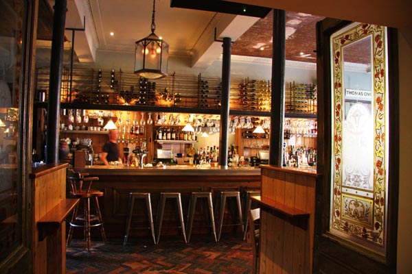
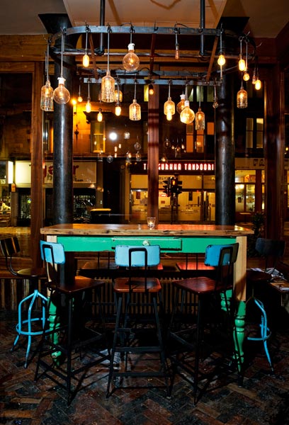
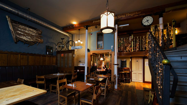
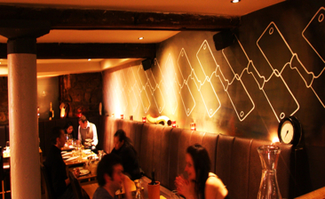


Photo 1-4© 5pm
Photo 5-7© Surface id
Subscribe to:
Comments (Atom)


