Friday, March 30, 2012

Barcelona Atlanta

Name: Barcelona Wine Bar & Restaurant
Location: Atlanta, GA
Designer: Square Feet Studio


Barcelona, located in Atlanta is easily one of my favorite  examples of modern and rustic mixed. With floor to ceiling wood-clad walls, graphic artwork, industrial fixtures and metal details, you simply cannot go wrong. Sticking to a minimal color palate of browns, blacks and whites allows for the space to feel harmonious and allows the materials to shine. I can't wait to make a stop in the next time i'm in Atlanta.


barcelona wine bar tapas inman park atlanta georgia

barcelona wine bar tapas inman park atlanta georgia

barcelona wine bar tapas inman park atlanta georgia

barcelona wine bar tapas inman park atlanta georgia

barcelona wine bar tapas inman park atlanta georgia

barcelona wine bar tapas inman park atlanta georgia


Wednesday, March 28, 2012

Restaurant Radio

Name: Restaurant Radio
Location: Copenhagen
Design: HolmbäckNordentoft

Created by the team also responsible for Noma, Restaurant Radio maintains the same simple sensibility. Warm, open, modern, and fresh can all describe this beautiful space that serves up new nordic cuisine. All food comes from Radio's own organic garden, local fishermen, and farmers and is beautifully served against a backdrop of worn, warm wood in a space filled with contrast and light.

Located in Frederiksberg, close to Copenhagen's scenic lakes, Restaurant Radio derives its name from the city's old Radio House. Photo by Anders Hviid.

The dining room is outfitted with Slab Chairs by Tom Dixon. The floor is Douglas fir, treated with white soap and lye, from Danish company Dinesen. Photograph by Anders Hviid.

The restaurant flatware is from the design firm Normann Copenhagen. Photo by Anders Schønnemann.

A Moooi Chandelier hangs above two large photographic images of produce from the farms. Photo by Anders Schønnemann.

Photos 1-4 © Remodelista via Anders Hviid

Sunday, March 25, 2012

Midwest's Best: Brew

Name: Brew
Location: Traverse City, MI
Architect: Moss

As a design firm focusing on the Midwest food scene, nothing excites us more than a well done interior located right here in the Midwest.
Moss, who coincidentally created local favorite 'Filter' in Chicago's Wicker Park area, was able to transform an abandoned space in Traverse City into a lively and dynamic coffee shop.

Friday, March 23, 2012

Nando's

Name: Nando's
Location: Kent, England (Originally started in South Africa)
Designer: Blacksheep

Chain restaurants typically don't do much for me on the design front. However, it seems more and more brands are starting to realize the importance design makes in a successful business, chain or not.
With brands like McDonalds and Starbucks hiring design firms and rebranding their store experiences, it seems our interactions with chain restaurants could drastically change over the next few years. One chain that clearly recognizes the importance of design on brand recognition is Nando's. Originally of South Africa, they have expanded globally. The space below, located in England was designed by Blacksheep is tastefully done. Utilizing natural materials and playing with color, they have managed to achieve a space that feels original and unique while also remaining warm and inviting.


All images © Design Milk


Wednesday, March 21, 2012

Lemongrass

Name: Lemongrass
Location: Las Vegas

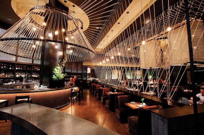
Located in the Aria Hotel, Lemongrass is the first thai restaurant on the strip. The interior is modern and yet casual. With rope used to create the main visual attraction they managed to define spaces, add architectural detail, and add energy to the space.


Image 1 © Las Vegas Sun
Image 2-4 © Examiner


Monday, March 19, 2012

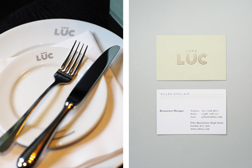
Cafe Luc

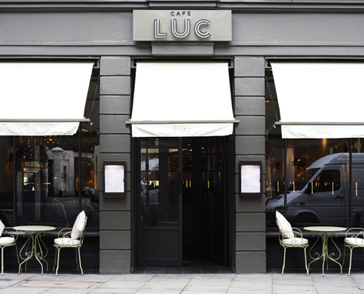
Name: Cafe Luc
Location: London
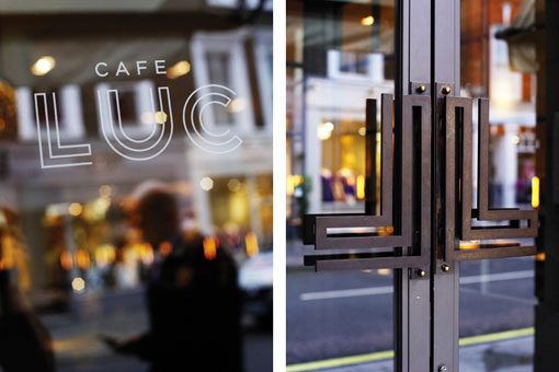
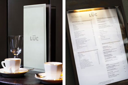
Branding & Graphic design: Here Design

Today comes to you with another great example of brand identity for restaurants.

 The most common element I witness clients and restauranteurs miss, is brand identity. In order to be successful you must set your space up as a unique experience. Your space must be recognizable and your message needs to be carried through throughout the diners experience. With social media growing faster every day, most customers dining experiences actually start well before they arrive at your space. Establishing your identity and message through graphic design, web design, and social media presence cannot be brushed off. Cafe Luc did a great job of translating the dining experience you will have within the space, to their identity, branding, and logo. All aspects communicate a chic, comfortable, upscale and classic vibe, take a look;


Image 1-6 © Design Work Life
Image 7-10 © Tuannhaid

Friday, March 16, 2012

Jane


Name: Jane
Location: San Francisco
Designer: Ken Fulk, Inc.

With the unseasonably warm temperatures currently sneaking into Chicago, my mind has been craving a bit of inspiration that is bright, clean, and cheerful. Jane, located in the Pacific Heights neighborhood of SF is just that and more. Bright, clean, inviting, and a hint of playful quirk easily make this place stand apart from the crowd.

2123 Fillmore Street


Cozy banquette seating
Photos 1-6 © Jane

Wednesday, March 14, 2012

Clarke's Bar & Dining Room

Name: Clarke's Bar & Dining Room
Location: Cape Town, South Africa


Clarke's is on of those places that I wish was located in the US. The minimalist exterior, simple and clear signage, use of natural materials and execution of contrast are perfect. The entire place feels cohesive, seamless, comfortable, and carefree. Clarke's is a perfect example of well done simplicity and a reminder to us all that we don't need more for the space to feel special.


all photos © Guy With Camera

Monday, March 12, 2012

Local Favorite; Caffe Streets

Name: Caffe Streets
Location: Chicago
Architect: Norsman Architects

Located in the Wicker Park neighborhood of Chicago; Caffe Streets has managed to bring something a bit different to the coffee scene. A modern yet organic interior features high-top community tables, benches with permanent tables, an intricate multi-layer, topographic style ceiling, as well as full scale street lights. Their cappuccinos are great but the environment and interior are what truly make this a local favorite.
Related Posts Plugin for WordPress, Blogger...