Location: Australia
Design: March Studio
Branding/Logo: Fabio Ongarato Design
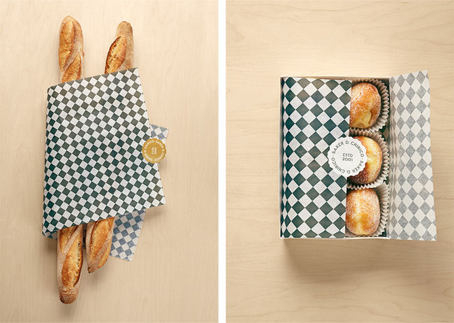
At the office, we swoon anytime we see a great, cohesive concept. Baker D. Chirico nailed it. Keeping the palate clean and limiting it's colors to black, white, and blonde keeps the interior space and branding fresh and allows for a juxtaposition between tradition and modern. Allowing the bread storage to be an architectural and sculptural fixture gives the space a feeling of the unexpected and keeps the concept unique.


All photos © ID via Peter Bernnetts


No comments:
Post a Comment