Monday, December 30, 2013

Earl Canteen

Name: Earl Canteen
Location: Melbourne, Australia
Design: Unknown


With it's second location now open in Collin's Place, Earl Canteen is proving to be a new direction for grab and go eateries. Their newest location uses their existing color and material palate but introduces  their graphic pattern on a larger scale. 

Tuesday, December 24, 2013

IMIG's

Name: IMIG's
Location: San Diego, CA
Design: All the bells & whistles


Located within the Lafayette Hotel in San Diego, IMIG's has it's own distinctive style making it a great dining experience even for locals. 

Friday, December 20, 2013

ilili Box

Name: Ilili Box
Location: New York, NY
Design: Unkown


Every once in a while a concept will come along that is all together refreshing. ilili Box's take on modular construction and pop-up shop lunches is just the breath of fresh air their trends needed. 

Thursday, December 5, 2013

Ranger Station

Name: Ranger Station
Location: Snowmass, CO
Design: Scout Regalia


As quickly as winter has appeared, so too have the thoughts of a snowy mountain getaway. New Belgium's Ranger Station, located near lifts at Snowmass Village, has the rustic yet contemporary vibe that is the perfect aesthetic for it's mountain local. 

Friday, November 29, 2013

Essex

Name: Essex
Location: Seattle, WA
Design: tbD


Essex, located near the Ballard area of Seattle, is a bright and inviting space that has quickly made it on my 'I need to get there' list. Playing with contrast to create balance created a welcoming space.


Tuesday, November 26, 2013

Truth Coffee Shop

Name: Truth Coffee Shop
Location: Cape Town, South Africa
Design: Haldane Martin


One of the most noticeable trends throughout the world currently is the influx of industrial. With a raw nature, truth of materials, and authenticity it is easy to see how so many have grown to love this aesthetic. As with any trend, there grows the group of people who yearn to be different and to expand past what is 'trendy'. One of the most common trends I see coming into favor is Steampunk. While I can see direct link from industrial to steampunk, I feel the need to stress that these two styles are by no means the same. Truth Coffee Shop is a great example of what steampunk represents and showcases the differences between the two styles flawlessly. 

Thursday, November 14, 2013

Damson & Co

Name: Damson & Co
Location: London
Design: Central Design Studio


Damson & Co has done a great job layering multiple styles together to create a warm and classic space. 
Industrial and classic touches add depth and visual interest to the otherwise utilitarian interior.


Tuesday, November 12, 2013

Our Work: Foursided

Name: Foursided
Location: Chicago, IL
Design: Kaper Design, LLC
Photography: Kyle McKenna


Kaper Design is excited to share our latest work in Chicago! Located in the heart of East Lakeview (Just a few blocks down from Dryhop, too.), Foursided is a neighborhood staple for those looking to get the best framing or unique gift. Being the original location, it came time for a facelift and we were happy to jump on board. Follow the jump below for a look at their new space.


Thursday, November 7, 2013

Bar Sajor

Name: Bar Sajor
Location: Seattle, Wa
Design:

Matt Dillon, 2012 James Beard Award Winner and chef/restauranteur behind Sitka and Spruce, opened up Bar Sajor early this year in Pioneer square.  With a similar open kitchen layout and earthy lightness, the interior feels like a more 'dressed up' version of Sitka & Spruce in all the right ways.

Tuesday, November 5, 2013

LA Condesa

Name: La Condesa
Location: Austin, TX
Design: Joel Mozersky & Michael Hsu 


Colorful and retro with a touch of eclectic works perfectly for Tex Mex restaurant, La Condesa. Layering industrial materials with soft leathers and bright colors creates a warm and vibrant space fitting of the food. 

Thursday, October 31, 2013

Picnic

Name: Picnic
Location: Paris (Concept; Not Built)
Design: Studio Ko

Picnic, a concept restaurant created in Paris showcases how minimalist design, paired with bold pattern, can create a vibrant and fun experience. 

Monday, October 28, 2013

TanakaSan

Name: TanakaSan
Location: Seattle, WA
Designer: Graham Baba Architects.


Warm, urban, and inviting TanakaSan, located in Assembly Hall, has it all going for it. As one of a handful of dining spaces among the Assembly Hall collection, TanakaSan faced some interesting special challenges.


With the kitchen separated from the dining space, a small bar was added which allows breakfast to be served in the morning and adds extra seating for casual drinks or overflow diners. 

The space is open, light, and industrial but remains comfortable and warm. The constant movement of the space and doors that open onto the patio add energy to the space and allow it to keep a constant connection to everyone coming and going through the building.


All of the tables are clean lined and light with airy black slat seating. Proving the restaurant is anything but traditional, each table is outfitted with a plastic animal (typically a dinasour of some sort) adorned with a metal chain and/or plant situated in its back.


All images via Via6 Facebook, Suzie Pratt Flickr , & Unknown

Friday, October 25, 2013

Duende

Name: Duende
Location: Oakland, CA
Design: Arcsine Architecture in collaboration with multiple local artisans.


With today's highly competitive restaurant scene, restaurant owners know that the need to offer more than just a great plate of food in order to attract and keep guests. Duende, located in Oakland, California was crated with this in mind and offers a bit for everyone. 

Wednesday, October 16, 2013

Gusto

Name: Gusto
Location: Toronto, Canada
Design & Photography: Munge Leung


Revitalizing a former auto body shop, Gusto 101 crafted an industrial and intimate Italian trattoria.


Wednesday, October 9, 2013

Sitka & Spruce

Name: Sitka & Spruce
Location: Seattle, WA
Design: Unkown


Located in Melrose Market, a vintage auto garage dating back to 1919 and 1928 respectively, Sitka & Spruce has quickly climbed to the top of my Seattle restaurant list. With an over the top open concept and location amongst exceptional vendors, it's easy to see why. 


Monday, October 7, 2013

Clive Burger

Name: Clive Burger
Location: Calgary, Canada
Design: Unknown

Clive Burger is a wonderful example of a fast casual space with a modern and fun interior. Utilizing cartoon-esq graphics paired with a restrained material and color palate, allows the space to feel whimsy while establishing a clean and modern space. 

Friday, September 27, 2013

The Commune Social

Name: The Commune Social
Location:Neri&Hu Design and Research Office
Design: Shanghai, China


The Commune Social is a great example of a well balanced, rustic meets modern, space. With small, compartmentalized interior spaces, each area is minimal and well defined.

Wednesday, September 25, 2013

Urban Coffee Farm & Brew Bar

Name: Urban Coffee farm & Brew Bar
Location: Melbourne, Australia
Design: Hassell


Designed for Melbourne's Food and Wine festival, the Urban Coffee Farm & Brew Bar dissects the coffee beans travel. Utilizing the materials used for transportation, the pop up allows guests to interact and engage with the coffee making process. 

Monday, September 23, 2013

Umami Burger Arts

Name: Umami Burger Arts
Location: Los Angeles, CA
Design: Westin Mitchell


As a chain of restaurants, Umami Burger did a great job crafting an industrial and warm space utilizing exposed, raw brick and muted tones. 

Friday, September 20, 2013

VinaterĂ­a

Name: VinaterĂ­a
Location: Harlem, NYC
Design Jonsara Ruth


VinaterĂ­a is a great example of vintage made new again; but in a pulled together and thought through manner. 

Wednesday, September 18, 2013

Mikkeller Bar

Name: Mikkeller Bar
Location: San Francisco, CA
Design: Martin heid design/build


An American take on a Copenhagen brewery, Mikkeller is as much a standout for it's location as it is for the design. 


Friday, September 13, 2013

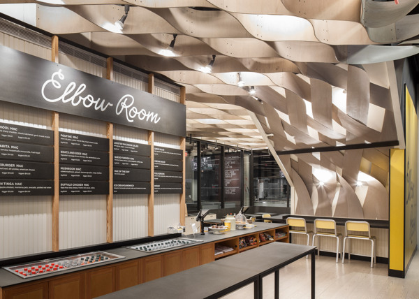
Elbow Room

Name: Elbow Room
Location: Brooklyn, NY
Graphic Design: mgmt. design
Interior: Greg Yang Design


I love it when the graphic design, identity, and interior all come together to form a cohesive space and presentation. The Elbow Room restaurants are a great example of this cohesive and thought through design. 

Wednesday, September 11, 2013

SLA

Name: SLA
Location: Amsterdam, Netherlands
Design: Nicemakers


With the world taking a deeper look at it's food, how we eat, and the care of our ingredients, it's always fun to see how these ideas translate into built environments. While the US is focusing on farm to table, warm woods, raw materials, and an overall emphasis on the rustic and farm-like feel, SLA has gone in an equal, but opposite direction, focusing on the greenhouse.  

Related Posts Plugin for WordPress, Blogger...