Wednesday, June 27, 2012

Tank.

Name: Tank.
Location: Australia
Design: Anna Drummond Design


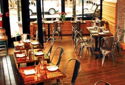
Tank. is a modern fish & chippery designed to play on the traditional greek fish and chips. Keeping a simple color palate of blue and white, which furthers the concept of freshness and seafood while playing off the traditional Grecian colors, the space takes on a fun, clean atmosphere. 

Monday, June 25, 2012

Local Favorite; GT Fish & Oyster

Name: GT Fish & Oyster
Location: Chicago, IL
Design: Karen Herold/555


GT Fish & Oyster opened up in the Near North area of Chicago over a year ago and I'm not sure how I've not posted about it yet. The space is extremely well designed and found it's inspiration from luxury yachts. With a bright and open entry and bar area featuring a boomerang shaped table, the space seamlessly evolves into a darker, more intimate dining space tucked in the back.

Friday, June 22, 2012

Nomiya

Name: Nomiya
Location: Paris
Design:Pascal Grasso, Laurent Grasso 


GRASSOrestoextNUIT2_093

Designed as an alternating, 'pop-up' style restaurant located on the top of the Le Palais de Tokyo museum is a stunning gem. With full views of the Eiffle Tower and seating for 12-14, the space is intimate and relaxed with the majority of the surfaces designed to draw your eye out, rather than in. 

GRASSOrestoEXTtoitjour069 GRASSOrestoEXTtoitjour069

Wednesday, June 20, 2012

Creative Alliance Cafe


Name: Creative Alliance Cafe
Location: Baltimore, Maryland
Design: Kroiaz Architecture & PI.KL

The Creative Alliance has acted as the community hub for gallery and artists space for over 20 years. With the most recent expansion, they tackled adding a restaurant and bar space with full commercial kitchen to the mix and the results are beautiful.

Monday, June 18, 2012

'wich

Name: 'wich
Location: Hong Kong
Design: Ken Lo(branding/packaging)


There is something beautifully simple when a restaurant concept comes together perfectly. When branding, logo, packaging, and interior all evoke the same message, it allows the guest a full experience.


Friday, June 15, 2012

Grounds of Alexandria

Name: Grounds of Alexandria
Location: Sydney, Australia
Design: Caroline Choker and Natalie Longhean


The Grounds was born out of a love for coffee and coffee education. The entire space is filled with details, all of which make the space warm and inviting to any guest. Set amongst an industrial backdrop of crumbling bricks, exposed beams, and metal fittings, the furniture perfectly contrasts the space and adds a bit of softness. With lush plants (both indoors & outdoors on their equally wonderful patio!) hanging from shelving and spilling over vases on solid wood tables, the organic elements also add a touch of softness and life into the space. 


Image 1-4 © Coffee Geek
Image 5-7 © What Katie Ate


Wednesday, June 13, 2012

Pizza East

Name: Pizza East
Location: London ( & soon, Chicago!)

One of my most anticipated openings for Chicago is Pizza East, even though it isn't scheduled to open until Spring 2014. Already a staple for progressive pizza in London, the Chicago location will be tucked away off of Randolph Street (located inside the upcoming SoHo House). Using the location as the inspiration, the interior takes on an industrial-rustic feel. In addition to the actual dining space, Pizza East Shoreditch, also houses a deli, allowing you to take the seasonal and specialty ingredients home with you. Chicago's Randolph Street also has an industrial past and I can hardly wait to see a few similar elements and materials in their first US Pizza East space.


Pizza East

All images © Pizza East

Monday, June 11, 2012

Dogmatic

Name: Dogmatic
Location: New York, NY
Design: EFGH


Dogmatic is a sight to be seen. What started as a simple hot dog cart, now has a brick and mortar home to call it's own. The truly impressive part of Dogmatic is what lies just inside of the sleek, industrial exterior. A simple interior with nothing more than a communal table and bench seating at first glance opens itself up (almost literally!) to accommodate diners. the butcher block communal table that runs through the center features individual wood seats that can be slid out from under the table and pushed back in when not in use to truly maximize the small size of the space. Even the waste basket is blended into the wall. All of these space saving solutions allow the space itself to feel sleek, modern, and clean and allow efficiency to be the center of attention. 

Friday, June 8, 2012

Local Favorite; Telegraph

Name: Telegraph
Location: Chicago

Telegraph could quickly become a new favorite destination for me here in the city. Located in Logan Square, the space is well designed and feature a great amount of craftsmanship throughout. From the unique, wood bar wrapping around both sides of the space to the rustic, dovetailed wood shelves the space creates a warm and inviting environment whether you come for a date or with a group of friends. Here are a few hits and misses;

Hits:
There wasn't a single low point in our entire meal. A rare but very welcomed situation!
-The food was rustic, simple but managed to surprise me with every dish. We had the Whipped Foie Gras, Roasted whole red snapper, blood sausage, and strawberry freddo sandwich with sunflower crunch. All were phenomenal, well executed, and a good portion size for two to split.
-The interior was well crafted and thoughtful.
-Attention to detail; throughout the meal, our table was cleared, wiped down, and re-set for every course. Silverware was brought to the table in a beautiful wooden box with just what was needed to replace what was removed. The wait staff retiring dishes to the kitchen placed a napkin over all bus tubs and dishes before walking through the space. It's the small, often overlooked by even the most popular restaurants, that truly made this experience amazing.

Misses:
-Two and four top table bases were a bit cumbersome and awkward. Wearing pants, it wasn't as big of a deal but had I worn a dress or skirt, it may have been quite awkward.
-The pendants in the front windows needed some help with their cord management. There were zip ties securing the cords and keeping them in place, but the zip ties were not cut and the long 'tail' could be seen. A small detail, but again extremely important.


Image © Telegraph
Image © Food Arts
Image © Kaper Design

Wednesday, June 6, 2012

Kitchen at Weylandts

Name: The Kitchen at Weylandts
Location: South Africa

A prominent home furnishings store in South Africa, Weylandts has taken on a fun twist to in-store-dining. Located on the top floor of their shop, they have set up a restaurant focused on fresh, seasonal, and local ingredients that come together to create simple, thoughtful dishes. The space itself is bursting with unique details and evokes warmth and creativity. The space's simple palate creates an almost Scandinavian feel with the Louis ghost chairs adding a layer of airiness to the bright space.


All images © Elle Decor SA

Monday, June 4, 2012

Coppa

Name: Coppa
Location: Boston

While walking through Boston's South End, we happened by Coppa, an enoteca focusing on nose-to-tail cooking and charcuterie. Set amongst rich, exposed brick walls with a wood slat bench running along the length of the space, the space feels lively and comfortable. Metal tolix-esq cafe chairs and metal/wood bar stools add a touch of industrial into the mix, a perfect environment for the up and coming neighborhood and chef.


Image 2 © boston.com
Image 3 © Moebiwan flickr
Image 4 © entrepreneur

Friday, June 1, 2012

The Gallows

 Name: The Gallows
Location: Boston, MA
Design: Sousa Design


While exploring Boston, we happened to pass The Gallows in the South End and couldn't help but stop and peak in. The narrow space was rich with details and laid out well, providing multiple seating groups in two distinct zones, one for dining and one for the bar. Considering the restaurant is located in the area of Boston where hangings took place, the Gallows creates a nod to this haunted past while keeping the space polished and open. With a material palate of wood, brick, and metal, the design is truly in the details. The slat ceiling, industrial metal-made pendants, and wall lights peering out from what appears as peeling wood, the design achieves a historical and aged feel while keeping true to the polished and emerging dining scene.

The Gallows


             Gallows_001


Images 2,3,5 © Creative soul in motion
Image 5 © Sousa Design
Related Posts Plugin for WordPress, Blogger...